Thursday 17 May 2007

Fundamentals of a Website

Layout and Composition

“Users are pleased by design but drawn to content”. Layout and composition is key to the success of a website, over complicating a design for the purpose of graphics is counterproductive, also the same can be said for an ugly site that is simple and easy to navigate, to reach a half way point is to succeed in the first aspects of layout and composition. A fundamental of layout is navigation, a user should be able to use the navigation of any given site without having to learn it, this is easier said t
han done especially is you’re an aspiring web designer who wants to make an impact with any original designs, however it is not impossible, tabs and hierarchical structures seem to give you some leeway with design and are understood by most users at a glance, whereas democratic linking structures (1 level) are even easier to navigate but look messy. All external links on a page should be secondary in design, as after all, who wants to take traffic away from their site.

White space is also quite important to your site as overloading your site with information can make the user feel enclosed and ultimately can be a deciding factor on those crucial moment when the user decided to click back and choose some
thing else from Google.


(Use of white space to prevent cramming (and hierarchical menu systems)) fig A

With layout it is also important in the structure of your page to either use the rule of thirds or what is known as the golden ratio PHI or 1.6180339, this is some irrational number that according to Pythagoras occurred in nature over and over and is also extremely visually appealing, however failing that 33.3% and 50% are also good divisions to structure by for maximum impact.


(50% symmetrical and use of white space) fig B


(rule of thirds 33% with white space / negative space) fig C

And after all of that you should still be thinking about Asymmetrical balance, being the balance of the image with the sum of the different components balancing each other out(fig B)

And on a final note for lay out and composition I will say don’t forget screen resolutions, most users are theses days using 1024x768 but make sure not to neglect users that may be browsing on the old 800x600 resolution, but this is mostly down to the propose of the website in hand and who is likely to use it.


Colour

Well I don’t really know what to say about colour, ill start with moods, now im sure I don’t really need to tell anyone this but colours are motley representative of moods, such as red could symbolise passion or maybe aggression, green could represent nature or maybe money, yellow could represent cheapness or even illness but the subtle changes in the colours will entirely change their feeling, the most important thing to remember is to build a pallet and to stick to it, everywhere in your site. Personally I find it good to use subtle gradients in my own work with backgrounds and using gradients to add shading on “3D” elements (just look at the UI of your operating system). Another ke thing to remember with colour is to make the content easy on the eye, aka don’t pick colours for text that will conflict with background colours and give your user a major headache.

Now going back to phi a Michael Semprevivo came up with applying this to the colour spectrum that we all know and love.
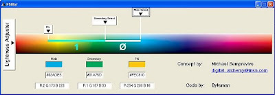
“Phi relationships in a color spectrum produce rich, appealing color combinations

Michael Semprevivo has introduced a concept called the PhiBar, which applies phi relationships to frequencies, or wavelengths, in the spectrum of visible colors in light. Colors in the spectrum that are related by distances based on phi or the golden section produce very rich and visually appealing combinations.”

To be continued.

Fundamentals of a website

Friday 30 March 2007

Frames in dreamweaver

wow, frame are magic......

ok. so looks like we have to write a blog on frames for website design, frames are versatile and helpfully for creating navigation in websites with ease but, there messy and apparently Google's search spiders don't bode well with them, i'm sure i would learn some more about SEO, but alas i still have no internet at home, and look I've lost the structure to this blog. so anyway frames, us full but outdated, you can do similar things in different ways without having to hack up your page not 6 different ones, still in a n00b and they look like the easiest way in which to make my website whilst outside of flash tbh.


erm..... filling up space..

well the deisiese may be bad but we have the cure, why not just use tables, admittedly once upon a time it might of been hard to do anything with tables but now with dream weavers Fantastic (and probably quite a few other website development packages) you can draw in boxes and then convert to tables afterwards, sure; absolute positing was is all very well some browsers might not be able to cope with it all, and so this makes shit easy.

so really I'm just blabbing cos its hard to fill theses things out with a limited amount os stuff to talk about, so onto th weather.

you know yesterday we had the weirdest weather XD hail rain hail rain etc etc...... and so...

waltzy out y'all

Friday 23 March 2007

MySpace - a pet hate

i hate my space, its a large collection of armature HTML and emo's however we have been assigned the task of researching and creating a my space page; and so, some of my preliminary views. the mass majority of myspace HTML is created via web forms, the coding in theses is relatively basic, containing script fro changing background images/color, changing table layouts, borders text sizes, and of course helping the mindless masses infringe on all copyright laws to their hearts content, with mostly badly fitting animations and hords of images of themselves with bad PhotoShop skills applied....

however while on myspace i did find some that raised above the bar a tad, with some elements of design applies, mostly tho theses are on group pages which proclaim themselves "HTML masers" or the suchlike.

Good myspace:

well yeah it might not look like the best thing on the planet but if you ever take the time to trawl through the various user pages on myspace you'll see what i mean, this is about as good as it gets ! its clean the colors are nice and the content is actually readable ! would you believe it !!!!


Bad myspace:
well need i say more, its hard to read, the colors are disgusting and im not sure whats worse the layout or the horrible tiles background, now don't get me wrong im not opposed to the music, but, it just looks bad !!!!!


so anyway, i spouse ill have to make one of my one now, hopfully with any luck ill make something that looks a little like to top one ! if thats possile on profile pages, as for all i know about myspace at the moment, they ristrict script in diffrent parts of the site !


peace out ya'll

ill update this once i have finished my myspace profile *shudders*

Friday 16 March 2007

is Google evil? we all use Google and if you say you don't then your probably a liar, but have you ever stoped a thought about where your information is sent when you hit that beloved search button? Your information is being constantly sorted and directly applied in the the Google-Machine! Improving your user experience, or so they say. buy we are constantly neglecting the authority of us federal agencies and even the CIA bypassing google's supposed good intentions and taking all they see fit.

"Google's Security Philosophy
As a provider of software, services and monetization for users, advertisers and publishers on the Internet, we feel a responsibility to protect your privacy and security. We recognize that secure products are instrumental in maintaining the trust you place in us and strive to create innovative products that both serve your needs and operate in your best interest."

cheers Google, reassuring.


- http://www.google.com/corporate/security.html

So im on blogger

well it looks like i joined blogger ! fun fun fun.


erm .... coming soon !