“Users are pleased by design but drawn to content”. Layout and composition is key to the success of a website, over complicating a design for the purpose of graphics is counterproductive, also the same can be said for an ugly site that is simple and easy to navigate, to reach a half way point is to succeed in the first aspects of layout and composition. A fundamental of layout is navigation, a user should be able to use the navigation of any given site without having to learn it, this is easier said than done especially is you’re an aspiring web designer who wants to make an impact with any original designs, however it is not impossible, tabs and hierarchical structures seem to give you some leeway with design and are understood by most users at a glance, whereas democratic linking structures (1 level) are even easier to navigate but look messy. All external links on a page should be secondary in design, as after all, who wants to take traffic away from their site.
White space is also quite important to your site as overloading your site with information can make the user feel enclosed and ultimately can be a deciding factor on those crucial moment when the user decided to click back and choose something else from Google.
 (Use of white space to prevent cramming (and hierarchical menu systems)) fig A
With layout it is also important in the structure of your page to either use the rule of thirds or what is known as the golden ratio PHI or 1.6180339, this is some irrational number that according to Pythagoras occurred in nature over and over and is also extremely visually appealing, however failing that 33.3% and 50% are also good divisions to structure by for maximum impact.

(50% symmetrical and use of white space) fig B
 (rule of thirds 33% with white space / negative space) fig C
And after all of that you should still be thinking about Asymmetrical balance, being the balance of the image with the sum of the different components balancing each other out(fig B)
And on a final note for lay out and composition I will say don’t forget screen resolutions, most users are theses days using 1024x768 but make sure not to neglect users that may be browsing on the old 800x600 resolution, but this is mostly down to the propose of the website in hand and who is likely to use it.
Colour
Well I don’t really know what to say about colour, ill start with moods, now im sure I don’t really need to tell anyone this but colours are motley representative of moods, such as red could symbolise passion or maybe aggression, green could represent nature or maybe money, yellow could represent cheapness or even illness but the subtle changes in the colours will entirely change their feeling, the most important thing to remember is to build a pallet and to stick to it, everywhere in your site. Personally I find it good to use subtle gradients in my own work with backgrounds and using gradients to add shading on “3D” elements (just look at the UI of your operating system). Another ke thing to remember with colour is to make the content easy on the eye, aka don’t pick colours for text that will conflict with background colours and give your user a major headache.
Now going back to phi a Michael Semprevivo came up with applying this to the colour spectrum that we all know and love.
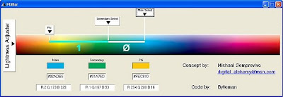 “Phi relationships in a color spectrum produce rich, appealing color combinations
Michael Semprevivo has introduced a concept called the PhiBar, which applies phi relationships to frequencies, or wavelengths, in the spectrum of visible colors in light. Colors in the spectrum that are related by distances based on phi or the golden section produce very rich and visually appealing combinations.”
To be continued.
Fundamentals of a website
No comments:
Post a Comment